Time for another Behind the Design of the book cover process! This time, I’m backing up a few months to a cover that remains one of my favorites: True Nobility by Lori Bates Wright.When I read the answers Lori filled out in the questionnaire, I knew I was going to love doing this one. She wanted the cover to feature her heroine–face not fully visible–in a beautiful blue hoop dress. Now, I confess: I love historical covers with gorgeous dresses. I think they grab the eye immediately. I love them as a reader, I love them as a writer, and I love them as a designer, LOL.
As a designer, these are far easier to find images for than everyday historical garb. Go figure, I guess they’re more fun for models to take pictures in. 😉
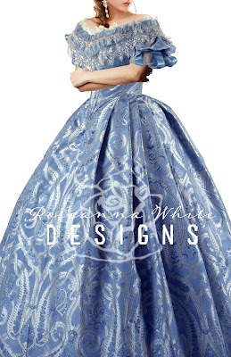
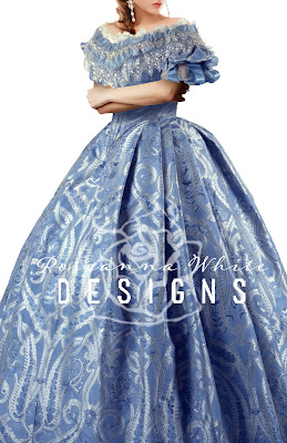
In this case, I began with the dress. I wanted to find something accurate to the era, and I was thrilled when I stumbled across public domain images from the Met galleries. When I saw this one, I knew I’d hit upon a winner.
In general, this fit the description Lori gave me very well. My only concern was that this fabric had a pattern, and I wasn’t sure that was exactly what she had in mind. But I figured it was worth a try, so this was what I started with.
As always, I started by selecting just the dress from an image in the collection that I liked best. I enlarged it until it filled the frame pretty much entirely.
Next was finding a model to put in it. When putting together images like this, the primary concern, of course, is matching angles. I tried several, eventually deciding that this young woman would work quite well. Her hair style was perfect, the body angle was right, and I liked the emotion and movement in her body position.
So just putting this girl’s face behind the dress, I got this.
Now, obviously we’re missing something here, LOL. And there was some other tweaking to be done too. First, I found some arms–from a different model–that I could put over top of the dress.
It was surprisingly challenging to find those! And then, of course, I had to make them look like they were natural, so I added some shadows.
And then, the hair. I had to move it so that it wasn’t tucked into the dress, and I also had to darken it just a bit.
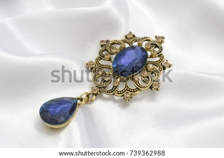
Now, the other thing Lori had specified was that the character had a blue and silver brooch that she wore on the dress. She told me what it needed to look like, so off I went in search. I found plenty that were close…but never quite it. I also needed something at an angle, to match the body position, not straight-on. Finally, I found this one.
It was almost perfect, except that it needed to be silver instead of gold. But that was a simple matter of de-saturating that part of the design. I then positioned it onto the bodice of the dress, and voila!
I was loving how this was looking! But next came the background. I tried quite a few, trying to find something that would identify the Southern setting…but when I plugged this one in, I fell in love.
Even that much is great, right? It was really starting to come together. But of course, I had to fuss with the lighting a bit. I made it warmer and added some sunburst effects to soften the line between dress and background.
And then I added a Sutro filter and some shading to the bottom so the title would stand out.
Which means it was time for the title! For fonts, I wanted something with just a bit of flourish to it, but largely a nice, bold serif. So I used Requiem Display for True and then one called The Last Font I’m Wasting on You (LOL) for Nobility.
Then, of course, the author name, and a divider to frame the title and separate it from the author.
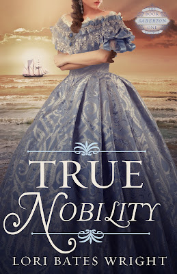
Almost done! It was only missing the series badge, which I added into the upper right corner, choosing one that matched the style of those dividers. And so here it is–the finished cover!
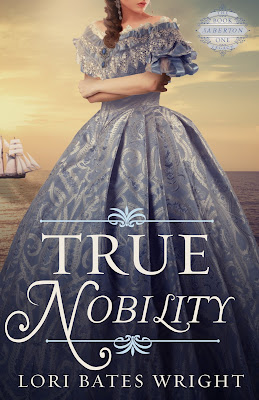
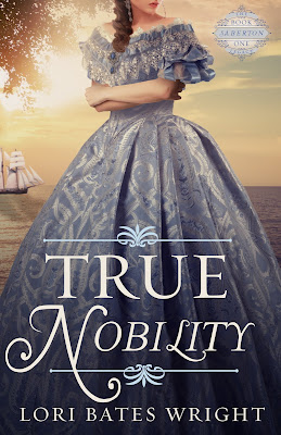
I was SO pleased with this, and when I sent it to Lori, she loved it too! We did try a few more backgrounds…
The sailboat is important to the story, so we liked the idea of those…but ultimately, we agreed that the original background was the best, and we decided to just incorporate the ship element onto the full cover.
I think one of the highest compliments I got on this one was from my husband who, when Lori sent me a copy, mistook it for one of the books I’d just ordered from Bethany House, LOL.
About the Book
Alone in an unfamiliar country where her noble title is useless. Everything she believes in is shattered. Driven by desperation, she risks it all to return to the one man whose love promises to be true.
Lady Victoria Haverwood, beloved daughter of a widowed Earl, has spent years at a fashionable boarding school longing for the day she can come home to finally take her place as mistress of Wrenbrooke. But when she becomes the target of a murderous plot, her idyllic plan is swiftly turned upside down.
Nicholas Saberton, an accomplished American Naval Captain, is commissioned to escort the earl and his daughter safely across the ocean to the lively shores of Savannah, Georgia. Pledged to protect her with his life, Nicholas is determined to remain immune to Victoria’s innocent charm. Focused on building his shipping empire, the Haverwood heiress and her quirky relatives become an irresistible diversion.
Danger shadows them. Soon the repercussions of her father’s past ensnare Victoria in a web of deception that threatens to consume her. Only her love for Nicholas will give her strength to discover the truth. But will it be too late?
Purchase Links
Amazon
Barnes and Noble
What do you think of the cover? What’s your favorite aspect of it?
Do you have any technical questions about how a particular step is done? I’m always happy to share, though I try not to get too technical in the posts as a whole, lest I bore the majority. 😉







Amazing!
I loved seeing the process. Amazing